

Project Overview
A professional windows and doors company approached us with a clear objective: to redesign their outdated website from the ground up. The previous site lacked structure, mobile responsiveness, and any form of SEO optimization. Visually, it didn’t reflect the quality of their work or instill confidence in visitors. Our mission was to create a modern, high-performing website that not only looked great but also delivered measurable results in terms of usability, performance, and long-term SEO growth.
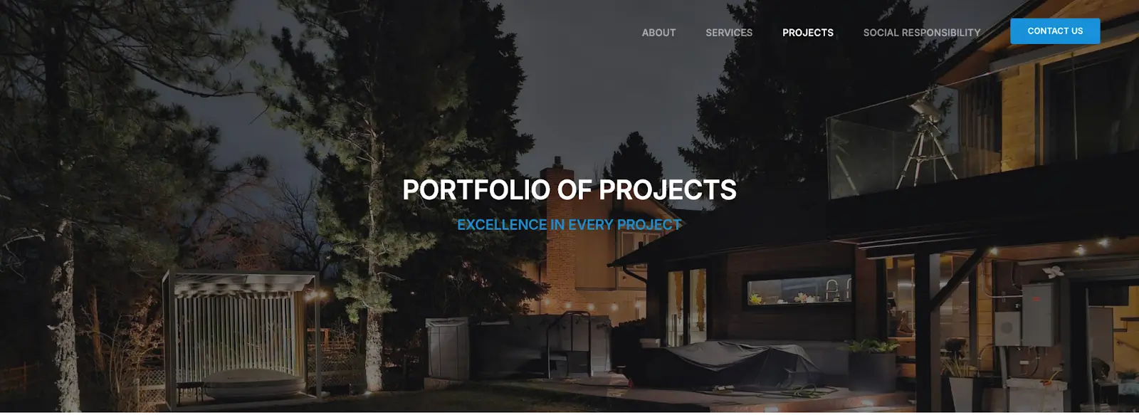
Home Page – First Impressions That Convert
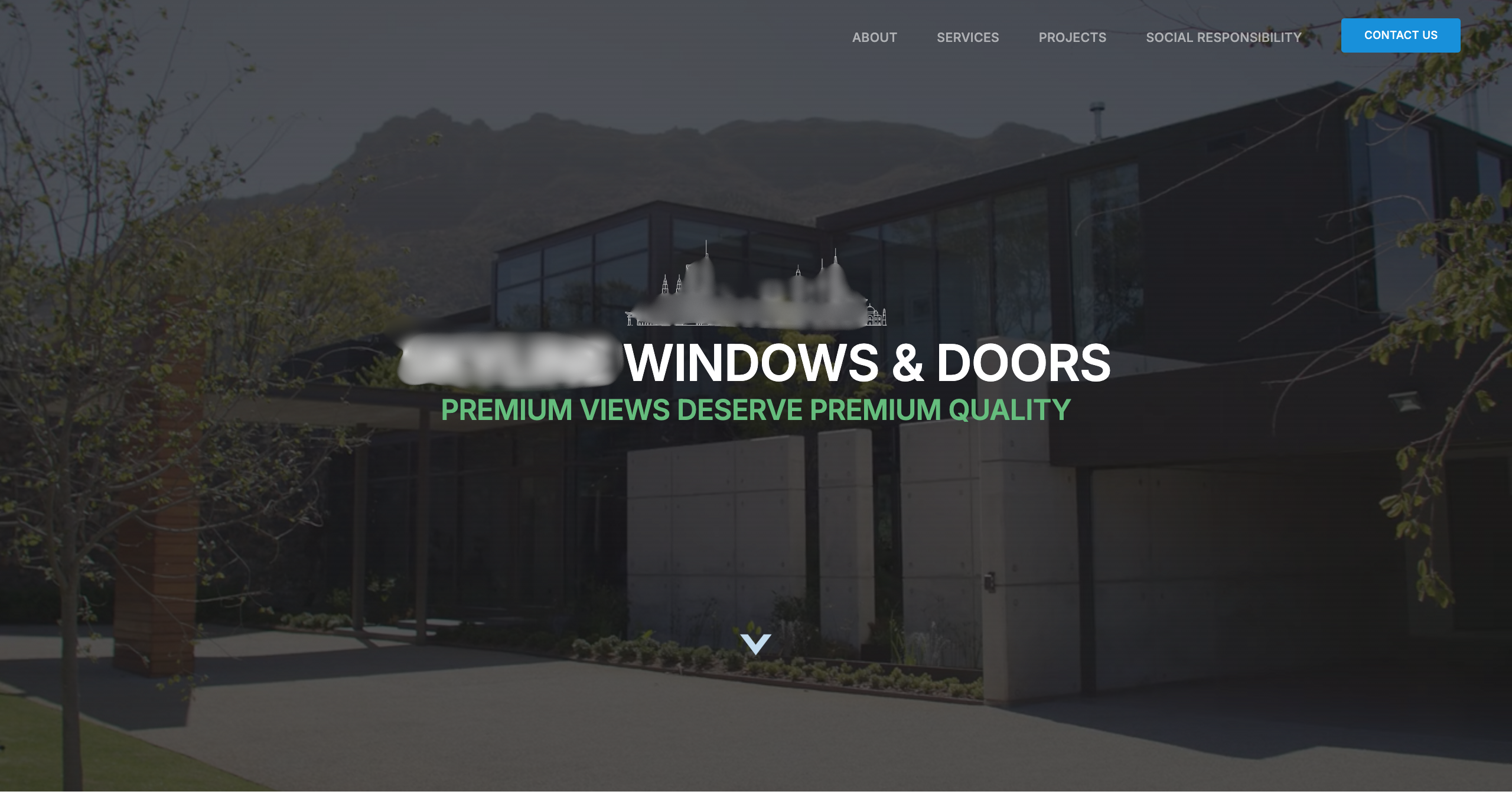
Before
The original homepage felt cluttered, visually flat, and lacked a clear message. It failed to highlight the core services, and users had no clear path to follow. The design wasn’t mobile-friendly, and key content was buried or missing altogether.
After
We built a streamlined, conversion-focused homepage with a bold hero section and strong messaging that clearly communicates the brand’s value. The updated layout includes service previews, trust indicators, and strategically placed CTAs to guide the user journey. We used clean typography, a spacious layout, and responsive elements to deliver a polished experience across all screen sizes.

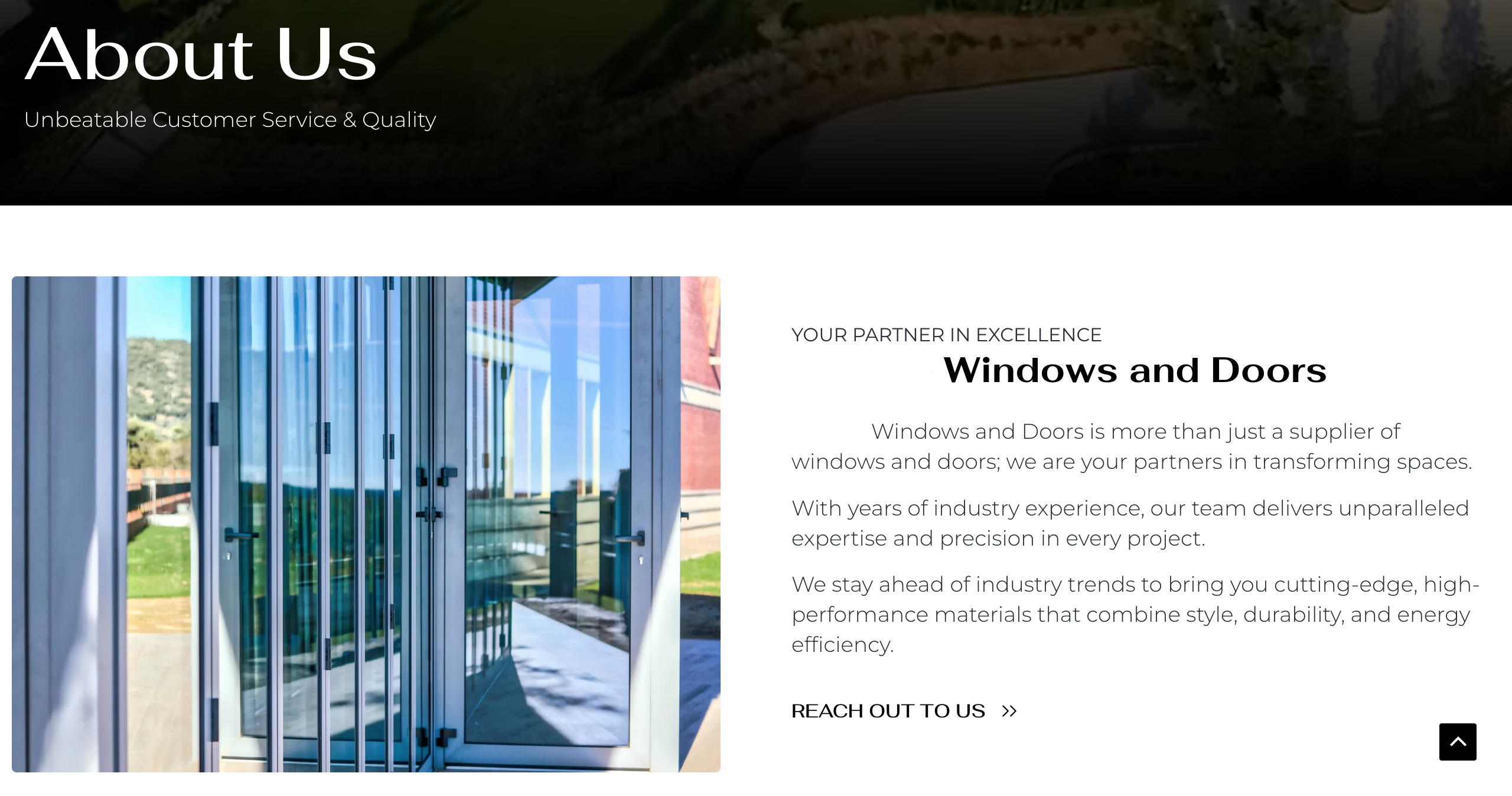
About Page – Telling the Brand’s Story
Before
The About page lacked meaningful content and failed to establish the company’s credibility. There was no mention of the team, experience, or core values, all of which are essential for building trust with potential customers. Without this foundational information, users were left without a clear understanding of who the company is or what sets them apart.

After
We crafted a compelling brand story and reorganized the content to emphasize mission, values, and the company’s journey. The page now includes structured sections with supporting visuals, allowing users to connect with the brand on a more personal level. It serves as a foundational trust asset within the site.

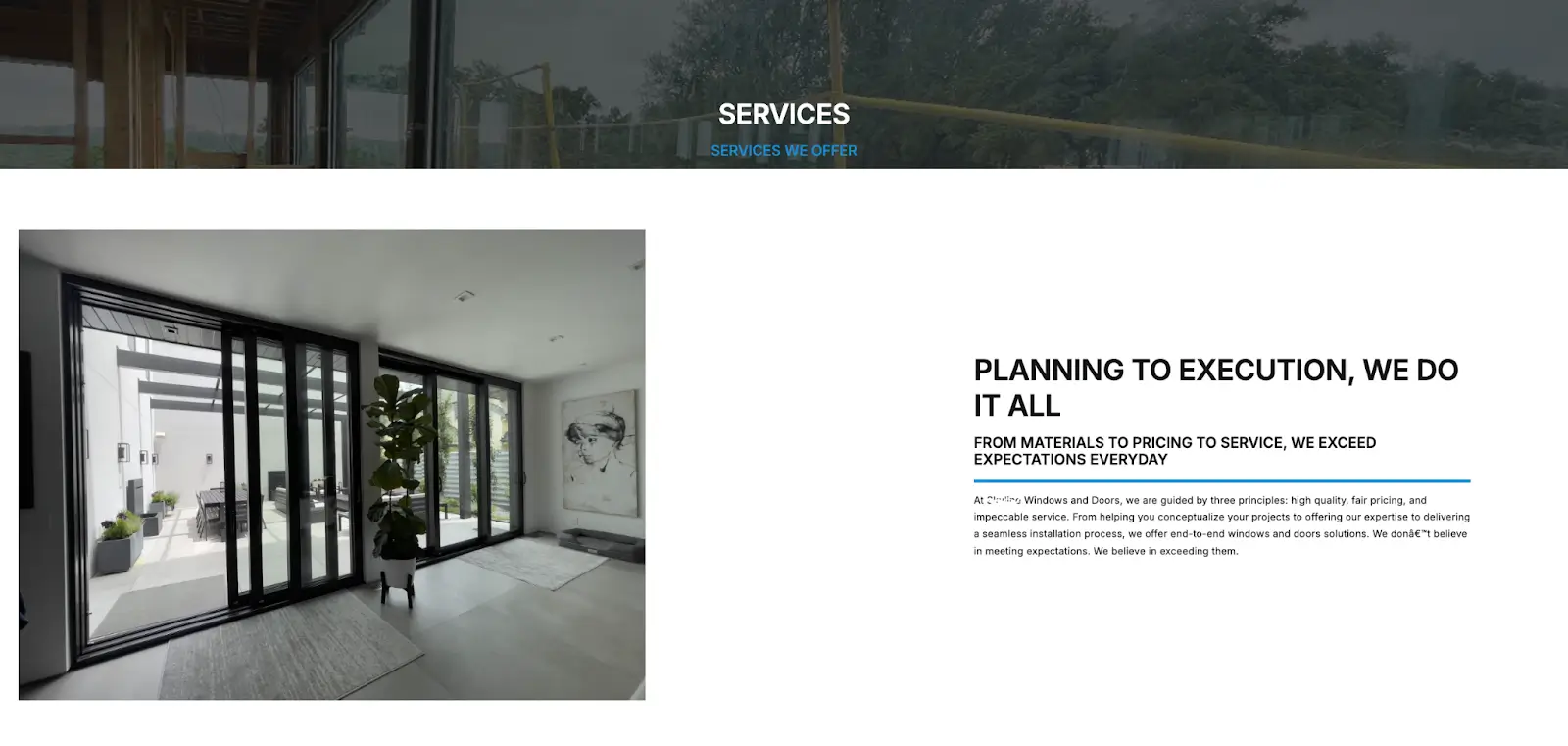
Services Page – Structured for Search & Conversions
Before
The Services page on the old website contained basic content, but it lacked clarity, structure, and flow. There was no clear separation between service categories, and the layout made it difficult for users to understand the full scope of offerings. Internal linking was missing or inconsistent, which not only disrupted user navigation but also weakened the site’s SEO potential. Overall, the page failed to guide users toward taking meaningful action.
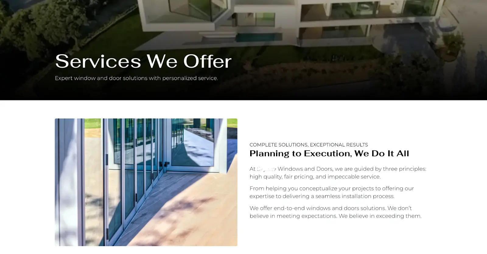
After
Each core offering is presented through visual blocks paired with brief, informative descriptions. Every section includes a clear call-to-action and strategic internal links that guide users toward the contact page or related project examples, helping improve conversion flow. The layout is fully responsive and built for a smooth user experience across devices. On the SEO front, the content has been carefully structured using keyword-optimized headings, alt tags, and clean semantic markup to support long-term search performance.

Projects Page – Proof of Work in Action
Before
The old website included a projects section, but it lacked structure, consistency, and visual clarity. Projects were displayed in a disorganized manner with minimal information, making it difficult for users to understand the scope or quality of work. The layout didn’t highlight project types or outcomes clearly, which limited user confidence and missed an opportunity to showcase the company’s capabilities.
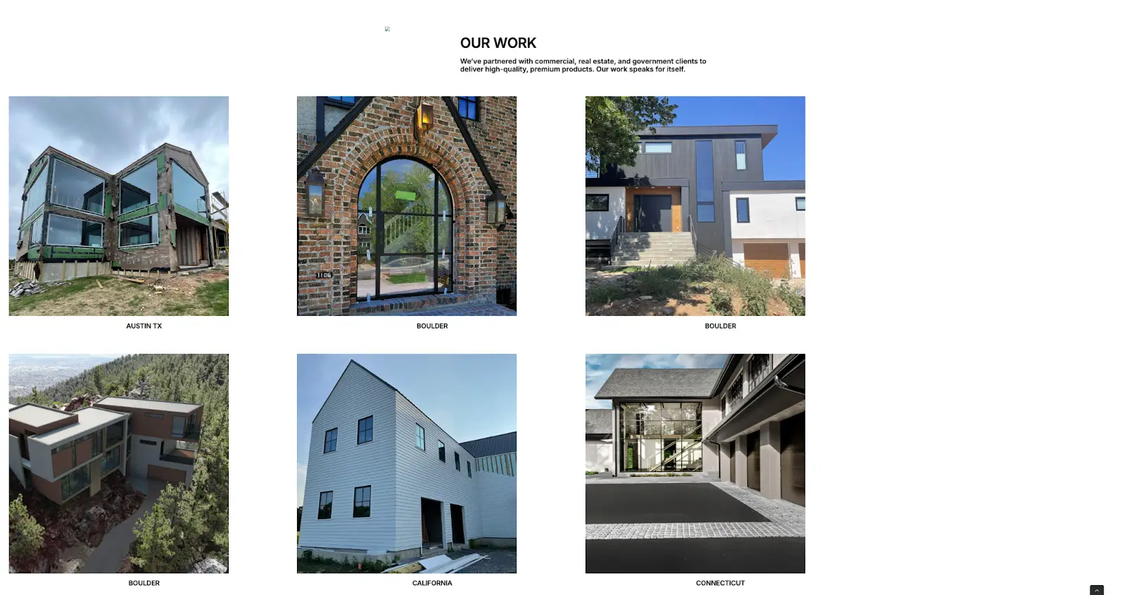
After
We completely restructured the Projects page to turn it into a powerful portfolio. Each project is now displayed with clean visuals, concise descriptions, and a layout that highlights the service type and potential for before/after comparisons. The new design makes it easy for visitors to browse and evaluate the company’s work. This section now builds trust, improves navigation, and lays the foundation for local SEO growth through structured content and future expansion.


Social Responsibility Page – Reflecting Brand Values
Before
The old website included a Social Responsibility section, but the content was limited, poorly structured, and lacked visual engagement. It failed to clearly communicate the company’s values, sustainability efforts, or community involvement. As a result, this important part of the brand’s identity was overlooked by users and underutilized as a trust-building element.
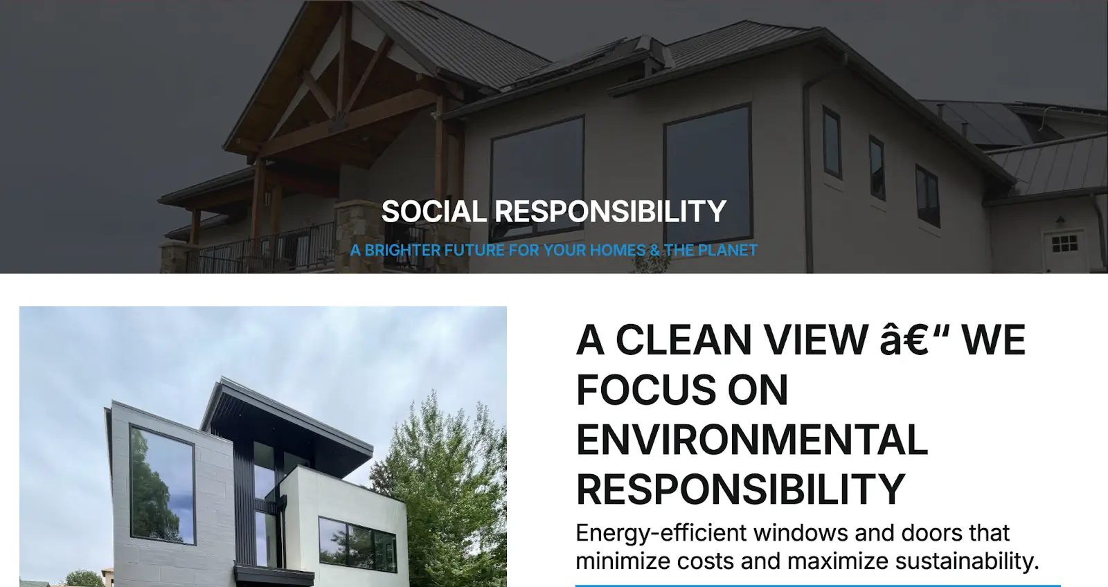
After
We redesigned the Social Responsibility page to better reflect the company’s commitment to ethical practices, sustainability, and community engagement. The updated layout features visually engaging sections that highlight key initiatives, volunteer efforts, and eco-conscious operations. Clear messaging, supporting visuals, and an organized flow now make this page a strong brand differentiator, helping to build emotional connection and trust with socially aware customers.
Contact Page – Built for Conversions
Before
The old website had a contact page in place, but it was minimal and lacked a user-focused layout. The form was generic, there were no supporting details like business hours or location, and it wasn’t optimized for mobile users. Overall, the page didn’t offer a smooth experience or create a sense of urgency or trust, which limited its effectiveness in driving inquiries.
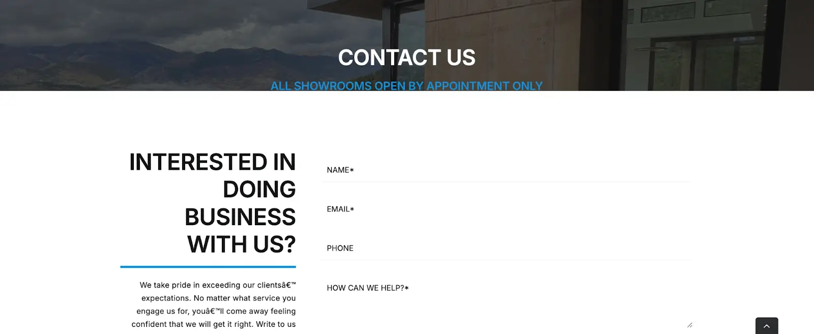
After
We redesigned the Contact page with a focus on simplicity, accessibility, and conversion. The new layout includes a custom form with the right balance of required fields, clearly displayed business contact information, and an embedded map for local visibility. It’s fully responsive across all devices and includes clear, action-driven language to encourage users to get in touch. The new structure now works as a reliable lead-generation touchpoint across the entire site.

Final Thoughts
This project wasn’t just a cosmetic upgrade. It was a full strategic transformation executed by the team at LazyMetrics. From rethinking user flow and simplifying navigation to optimizing each page for SEO, mobile responsiveness, and conversion, every decision was made with long-term digital performance in mind. We transformed an outdated and underperforming website into a fast, modern, and professional platform that truly reflects the quality and credibility of the business. With a stronger visual identity, clearer messaging, and a structure built for scalability, the company now has the foundation it needs to grow online. LazyMetrics is proud to have led this digital evolution.