
Project Overview
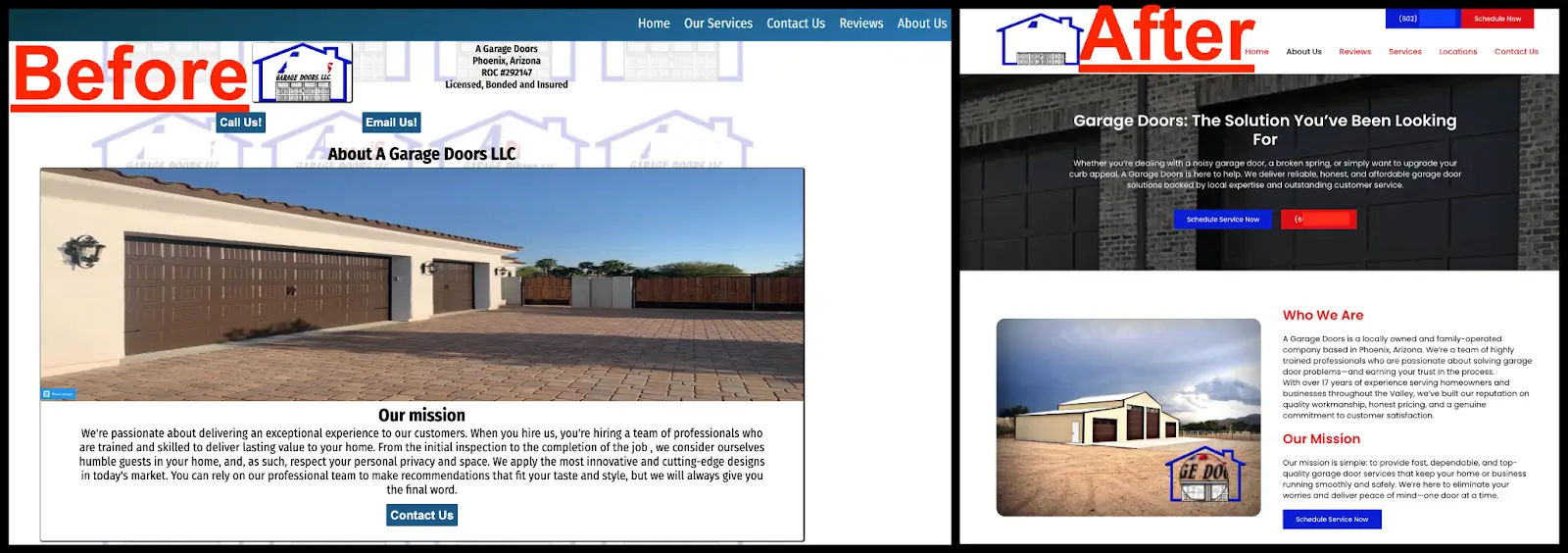
In an industry where word-of-mouth is still powerful, but online competition is increasing fast, a strong website isn’t a luxury, it’s a business essential. That’s why this garage door company approached Lazymetrics. Their existing website lacked clarity, mobile responsiveness, and the credibility needed to convert visitors into customers.
Our goal was to redesign their website into a modern, conversion-focused platform that better reflects their services, improves local SEO, and provides a smooth, trustworthy experience across all devices.
We took what wasn’t working, fixed it from the ground up, and delivered a clean, fast, and strategically structured digital presence. Here’s a breakdown of how we rebuilt every section to work harder for their business.
Homepage – Making the Right First Impression
The homepage is the first touchpoint. It had to feel trustworthy, service-oriented, and actionable within seconds.
Key Objectives
- Establish clear messaging and service focus instantly
- Communicate professionalism and local credibility
- Encourage immediate action (calls or bookings)
What We Did
- Redesigned the hero section with a looping video background to create a more dynamic and engaging first impression
- Updated the headline to emphasize trust and reliability
- Added two clear CTAs: “Schedule Service Now” and “Call”
- Integrated service keywords and location (Phoenix, AZ) up front for SEO relevance

We also enhanced mobile responsiveness, optimized visual hierarchy, and used strategic color psychology, red for urgency, blue for trust, to guide user actions effectively.
About Us – Humanizing the Brand
The previous About page was thin and generic. We reworked it to better connect with customers and highlight the company’s unique values.
Goals
- Tell the company’s real story
- Emphasize service quality and community focus
- Build emotional trust with homeowners
What We Did
- Shared their local roots and customer-first approach
- Highlighted their experience in residential, commercial, and emergency services
- Used friendly, conversational language to make the brand approachable
We transformed the About page from filler content into a meaningful brand asset that builds trust at a human level.
Reviews – Building Trust Through Social Proof
The original website lacked strong social proof. We knew testimonials would be a key credibility booster.
Goals
- Showcase real client satisfaction
- Reassure new visitors with authentic feedback
- Strengthen reputation for local SEO
What We Did
- Created a dedicated Reviews page with visually highlighted star ratings
- Featured handpicked testimonials from verified customers
- Organized content for easy scanning and fast trust-building

We let the client’s happy customers do the talking. The results speak volumes.
Services – Structuring Offerings for SEO & Conversion
Service information was previously buried or unclear. We restructured this page to improve discoverability and drive action.
Goals
- Clearly present all services
- Help users find what they need fast
- Optimize each section for long-tail keywords and relevance
What We Did
- Broke down services into focused categories: repair, installation, maintenance, etc.
- Wrote concise, benefit-led descriptions for each
- Added internal CTAs to schedule or book specific services


This not only improved the user experience, it also strengthened SEO performance for local search queries.
Locations – Expanding Local SEO & Clarity
The old website lacked a dedicated locations page, making it unclear where the business offered its services. In the new website, we built a fully optimized Locations page to fix that gap.
Goals
- Clearly list all service areas
- Boost SEO for city-specific searches
- Minimize confusion and reduce irrelevant inquiries
What We Did
- Created a structured Locations page featuring key areas like Phoenix, Glendale, and Chandler
- Optimized content with local keywords to improve visibility in map packs and local search results
- Added a call-to-action encouraging users to check availability in their area

Now, both customers and search engines have a clear understanding of the business’s service coverage.
Contact Us – Streamlined for Conversion
The original contact experience was slow and cluttered. We redesigned it for speed and simplicity.
Goals
- Reduce friction in contacting the business
- Ensure seamless mobile experience
- Support both emergency and routine inquiries
What We Did
- Created a minimalist, mobile-friendly contact form
- Enabled tap-to-call buttons across the site
- Reinforced 24/7 availability messaging

We eliminated distractions to make this the site’s highest-converting touchpoint.
Technical Execution
- Platform: WordPress
- Hosting: Cloudways
- Design Tools: Figma (UI + wireframes)
Performance Enhancements
- Mobile-first responsive design
- Lazy loading for improved speed
- Clean, scalable codebase
- Structured data/schema for SEO
On-Page SEO
- Optimized metadata and alt text
- Keyword-rich headings and URLs
- Location-specific service keywords
- SEO-friendly content architecture
Results
Post-launch, the business saw a significant increase in customer inquiries and search visibility, particularly on mobile devices where most conversions now occur.
Key Wins
- A complete transformation of their outdated website
- Streamlined user experience that drives more service calls
- Stronger visibility in local search results
- Higher engagement and trust from first-time visitors
Conclusion
This redesign turned an underperforming website into a strategic, sales-driven platform. By focusing on clarity, speed, mobile usability, and localized content, we helped this garage door service business compete in a modern, digital-first market.
Today, their website not only reflects their professionalism. It actively works to bring in new customers around the clock.
After
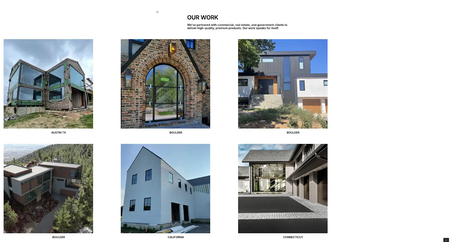
We completely restructured the Projects page to turn it into a powerful portfolio. Each project is now displayed with clean visuals, concise descriptions, and a layout that highlights the service type and potential for before/after comparisons. The new design makes it easy for visitors to browse and evaluate the company’s work. This section now builds trust, improves navigation, and lays the foundation for local SEO growth through structured content and future expansion.


Social Responsibility Page – Reflecting Brand Values
Before
The old website included a Social Responsibility section, but the content was limited, poorly structured, and lacked visual engagement. It failed to clearly communicate the company’s values, sustainability efforts, or community involvement. As a result, this important part of the brand’s identity was overlooked by users and underutilized as a trust-building element.
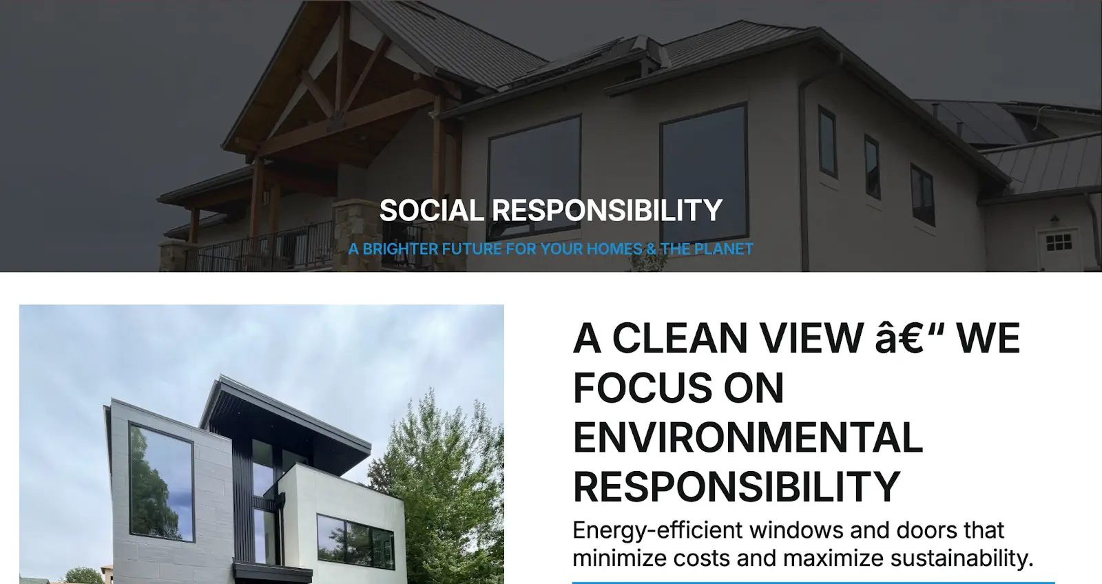
After
We redesigned the Social Responsibility page to better reflect the company’s commitment to ethical practices, sustainability, and community engagement. The updated layout features visually engaging sections that highlight key initiatives, volunteer efforts, and eco-conscious operations. Clear messaging, supporting visuals, and an organized flow now make this page a strong brand differentiator, helping to build emotional connection and trust with socially aware customers.
Contact Page – Built for Conversions
Before
The old website had a contact page in place, but it was minimal and lacked a user-focused layout. The form was generic, there were no supporting details like business hours or location, and it wasn’t optimized for mobile users. Overall, the page didn’t offer a smooth experience or create a sense of urgency or trust, which limited its effectiveness in driving inquiries.
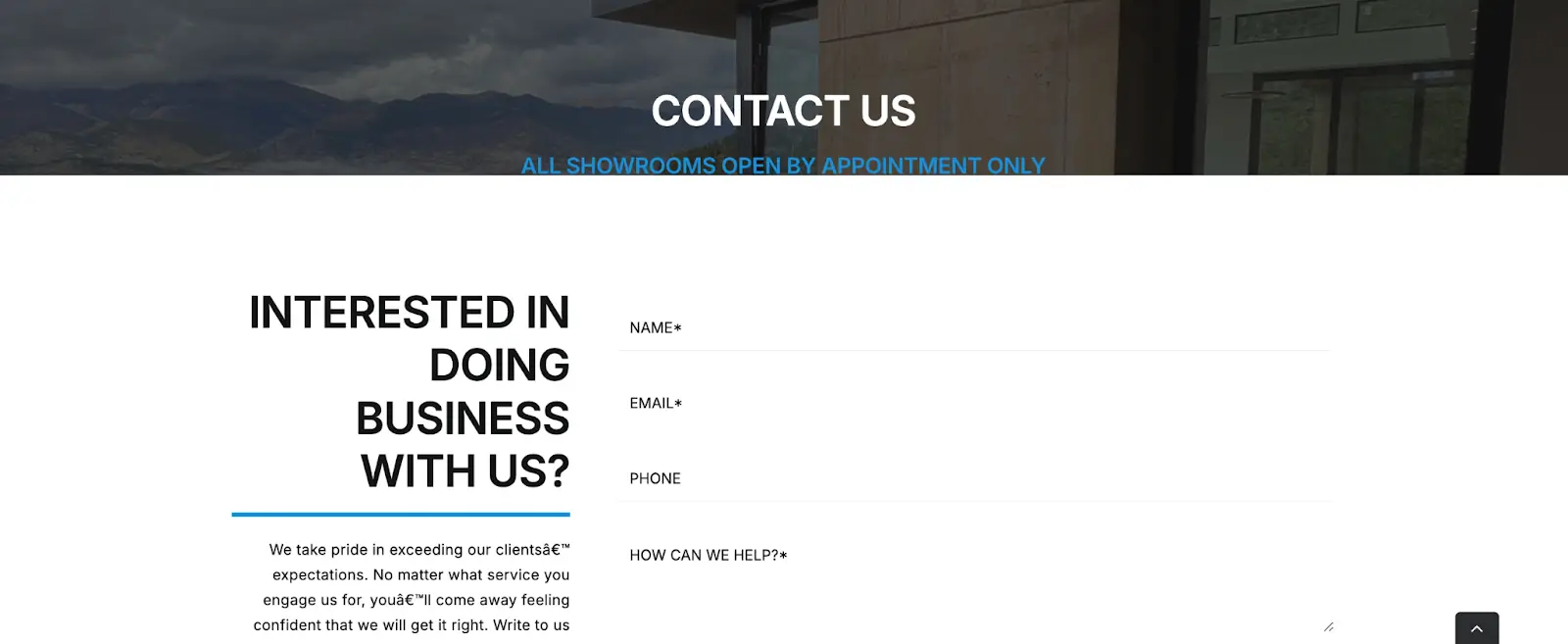
After
We redesigned the Contact page with a focus on simplicity, accessibility, and conversion. The new layout includes a custom form with the right balance of required fields, clearly displayed business contact information, and an embedded map for local visibility. It’s fully responsive across all devices and includes clear, action-driven language to encourage users to get in touch. The new structure now works as a reliable lead-generation touchpoint across the entire site.

Final Thoughts
This project wasn’t just a cosmetic upgrade. It was a full strategic transformation executed by the team at LazyMetrics. From rethinking user flow and simplifying navigation to optimizing each page for SEO, mobile responsiveness, and conversion, every decision was made with long-term digital performance in mind. We transformed an outdated and underperforming website into a fast, modern, and professional platform that truly reflects the quality and credibility of the business. With a stronger visual identity, clearer messaging, and a structure built for scalability, the company now has the foundation it needs to grow online. LazyMetrics is proud to have led this digital evolution.